Assignment 4 : Response to Tutor Feedback
Posted: June 7, 2012 Filed under: Assignment 4 : Response to Tutor Feedback, Assignments for TAOP 6 CommentsThe Art of Photography
Assignment 4: Response to Tutor Feedback
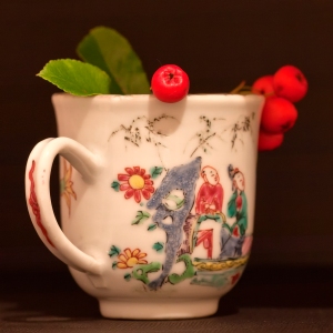
This was an Assignment that I struggled with due to technical issues of dealing with the lighting whilst wanting to stay connected with my subject. I was relieved to get positive feedback overall. My tutor also noted how I had struggled in one or two cases with the shiny surface of the cup and suggested that bouncing light from white reflectors rather than silver might have overcome this. She also suggested that I could try the Clone or Healing tool in Photoshop and experiment with various Opacity and Flow settings. Well – I did attempt this on No. 9 where you can see how the light fell at each side of the cup.
I spent some time experimenting with both tools but, unfortunately neither of them worked well enough. I think this was because there were striations of colour which couldn’t be duplicated accurately enough at least at my stage of technical know-how of Photoshop.
Suggested reading for the next Assignment – ( 5 : Narrative and Illustration)
I was guided towards the works of Olivia Parker, Josef Koudelka and Chris Steele Perkins and I wrote about the latter two here
I’ll write more about Olivia Parker in my response to feedback on Assignment 5.
7th June 2012
Re-Think
When I looked again at my Assignment prints I decided that although No. 9 definitely had too many striations of light/colour for me to improve on (at my stage of expertise) I should look again at the others. I thought I should at least try to rise to the challenge! I therefore looked again at 2, 5, 7 and 8 and used the clone and/or healing brush tool to see what I could do about the ‘imperfect’ effect of the light. The originals are at the top and re-done images are on the bottom.
No. 2 : Form
I think I have improved on the shine that shows between the middle berry and the blue.
No. 5 : Texture

There was some shine which showed on the top right of the cup; However, the re-worked version looks somewhat duller somehow so not an improvement.
No. 7 : Shape
I removed the shine over the man in red’s head and I think it is an improvement.
No. 8 : Shape
I know I wasn’t happy at all about the shine in the middle of the cup. I have removed it but, to me, it doesn’t improve the image as now it just looks dull.
Conclusion
I’m pleased that I did persevere even though I don’t think that some of the work was an improvement. I will submit prints of No. 2 and No. 7 with my assessment material.
8th June 2012


And after your lighting workshop and a little play on the common—one day when/if this rain ever stops—then you will learn to love lighting!!
I can only hope but I’m sure my pending assistantship will bring me on in leaps and bounds.
It will—promise!! Playing is the only way to get better at it!
Vicki reminded me of Lynne Collins’ work where she creates beautifully soft images with low light and long exposures. Still life’s can afford the luxury of time, portraits less so – unless it’s part of the aesthetic. Slow the process down by reducing the brightness and see what happens.
Thanks for the suggestion John. I hadn’t realised that a longer exposure can help to obviate shine. I’m really thinking now that I do need to revisit Part 4. Hopefully I’ll get further technical advice when I do the lighting Workshop in a couple of weeks.
Lowering the intensity of light won’t obviate the shine, but it will militate against some of the difficulties associated with it.